How Big Is Your TFSA? How Would That Compare To Past Historical Periods?

As of January 1st, everyone in Canada over the age of 18 has the chance to add another $6,000 to their TFSA. If you were 18 or older in 2009 your total original contribution room would be $75,500.
But that’s just contribution room, what about investment growth?
With investment growth where would a TFSA be? How much would it be worth? And how would that compare to other historical periods?
Let me preface this post by saying I don’t like to compare personal finances. Everyone’s path is different and it’s impossible to compare apples to apples. Even in the same financial situation everyone values money differently and therefore two people with the exact same income, assets, debts etc will have very different financial plans, part of the reason why financial planning is so important, and also so interesting.
That being said, in this post we’re going to compare hypothetical TFSA balances of today with those of the past. We’ve had a great “bull run” over the last 10+ years but what would it look like if we had different set of returns? What if we looked at the best periods and the worst periods in recent history to compare how the last 10+ years stacked up?
The TFSA has been around since 2009. Each year, once you reach age 18, you accumulate TFSA contribution room. In 2021, someone who was 18 or older in 2009 would have $75,500 in original contribution room. But with investment growth where would the actual balance be?
What do you think the top 5 and bottom 5 historical periods would be? And how do you think they’d compare with the last 10+ years?
(To make this simple we’ll use total return of the S&P 500, if you’d like to see this same analysis using a more diversified portfolio of Canadian, US, and Global equities as well as Bonds/Fixed-Income, please leave a comment and let me know)
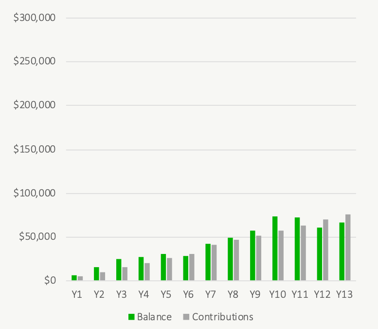
TFSA Growth From 2009 to 2021
If you had maximized your TFSA at the beginning of every year from 2009 to 2021, and if you had a portfolio made up of only the S&P 500, you would likely have around $200,650 in your TFSA today assuming you just made your $6,000 contribution today, that’s pretty amazing!
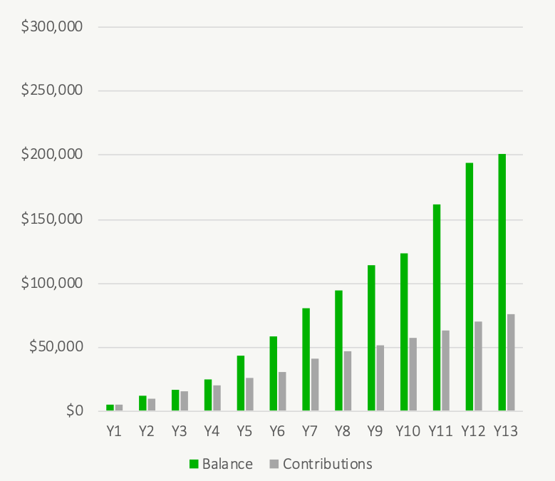
Of course, the 2009 to 2021 period was very unique. The TFSA was introduced at an interesting time, in 2009 we had just experienced the great recession and equity values were extremely depressed. TFSA contributions made during that time would benefit from these depressed equity values. Equity values took a few years to recover and since then have grown significantly. Anyone making regular contributions in the US market will have done very well over the last 10+ years. But how would that performance compare with other historical periods?
We’ve certainly had a good “bull run” the last 10+ years, but how does that compare with other bull runs of the past?
Or, what if we hadn’t been as fortunate? What if the TFSA was introduced at a different time? What would the worst historical periods look like?
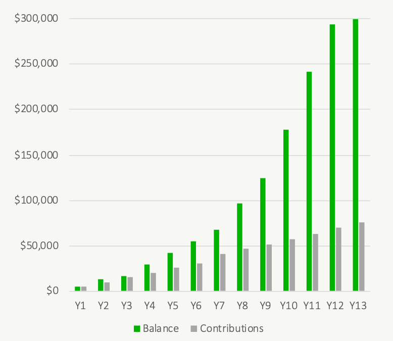
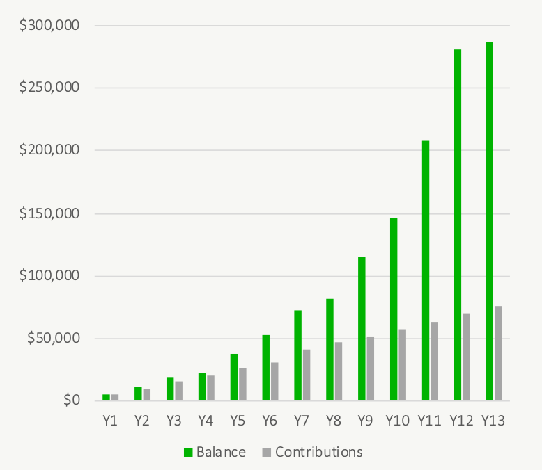
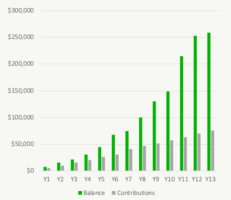
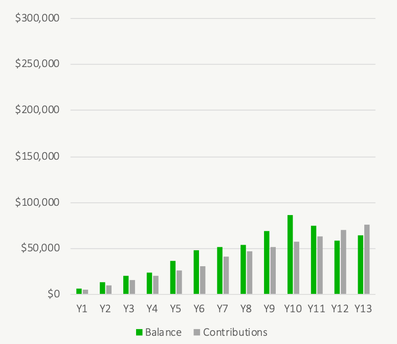
Top Five (Hypothetical) Historical TFSA Returns
We’ve had some impressive returns over the last 10+ years but can you believe that the recent 2009 to 2021 period doesn’t even break the top-10 let alone the top-5 historical periods?
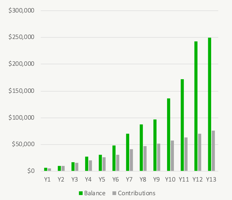
The best historical period would have a TFSA valued at nearly $300,000!
From number 1 to number 5, here are the best (hypothetical) historical TFSA returns…
Hypothetical TFSA Growth From 1988 To 2000
Hypothetical TFSA Growth From 1987 To 1999
Hypothetical TFSA Growth From 1975 To 1987
Hypothetical TFSA Growth From 1974 To 1986
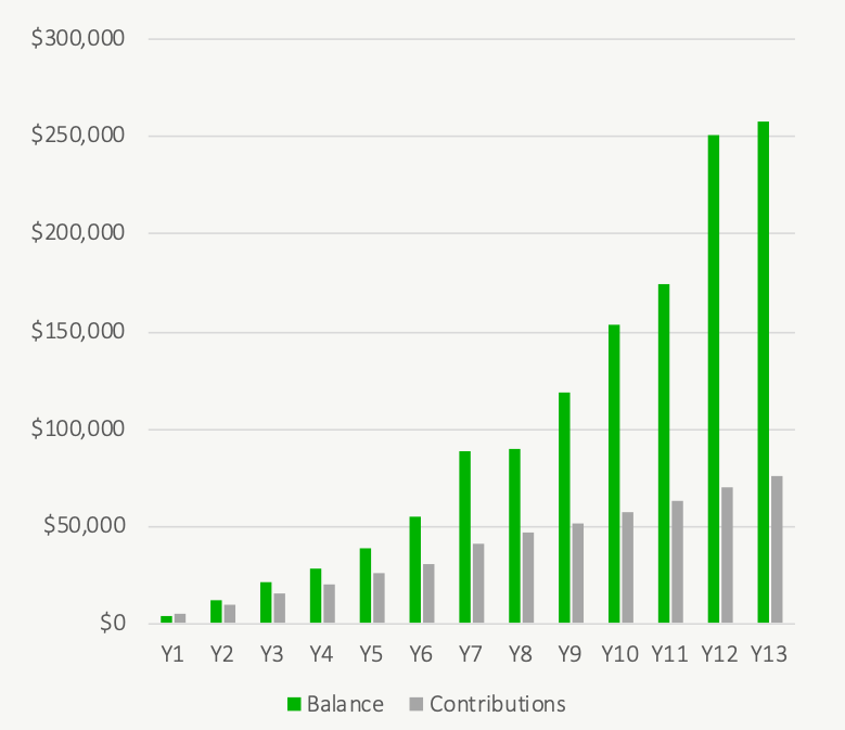
Hypothetical TFSA Growth From 1986 To 1998
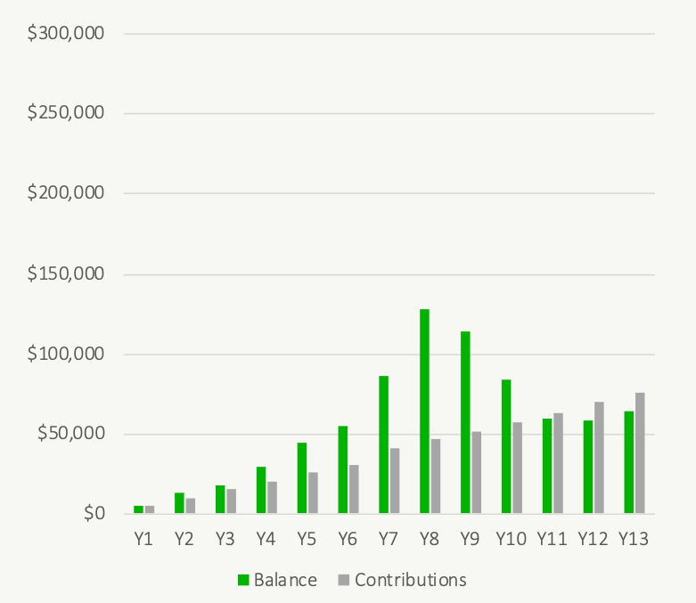
Bottom Five (Hypothetical) Historical TFSA Returns
Now for the worst periods. These charts are a good reminder that there can be some very long stretches of low/negative investment growth. The last 10+ years have been great, but it’s important to remember that future returns won’t always be so rosy.
From number 5 to number 1, here are the worst (hypothetical) historical TFSA returns…
Hypothetical TFSA Growth From 1920 To 1932
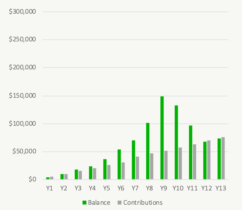
Hypothetical TFSA Growth From 1998 To 2010
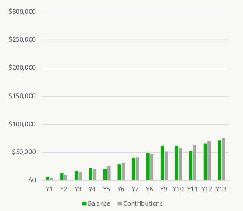
Hypothetical TFSA Growth From 1997 To 2009
Hypothetical TFSA Growth From 1963 To 1975
Hypothetical TFSA Growth From 1921 To 1933
Free Resources

Join over 250,000 people reading PlanEasy.ca each year. New blog posts weekly!
Tax planning, benefit optimization, budgeting, family planning, retirement planning and more...
Join over 250,000 people reading PlanEasy.ca each year. New blog posts weekly!
Tax planning, benefit optimization, budgeting, family planning, retirement planning and more...


This is pretty amazing! Thank you for sharing! For sure, I would very much like to see this same analysis using a more diversified portfolio of Canadian, US, and Global equities as well as Bonds/Fixed-Income. Thanks very much!